Chromebook-optimized textbook
This guide describes the design and features of the Chromebook-optimized digital version of the textbook Wisconsin: Our State, Our Story. This version is recommended for districts that use Chromebooks because it allows students to increase the size of the text and includes larger images that can be viewed in greater detail. While this version is primarily recommended for Chromebooks, it can also be used on iPads and other tablets with small screens.
Design
The design of the Chromebook-optimized version is simpler than the print version of the textbook. Images are larger, and less text appears on each screen. Here is an example:
The amount of content that appears onscreen will automatically change based on the device’s screen size and the size of the browser window. The following is an example of how the screenshot above would look after the browser window has been minimized:
Students can change the size and style of the font by choosing the “Aa” symbol in the blue navigation bar. This allows each student to choose the text size that will be the most readable to them:
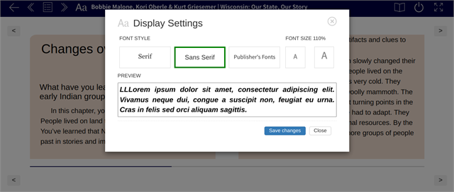
Making the font larger will automatically reduce the amount of text that appears onscreen. The following is how the original screenshot looks after the font size has been increased:
Images and Captions
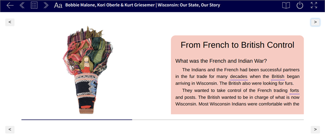
The Chromebook-optimized version has reflowable text and images, which means that segments of text and/or images that do not fit on the screen will automatically be pushed onto the next. Because of this, a header may appear on one screen while the corresponding body text is pushed to the next. Or, as in the following screenshot, a caption may appear on one screen and its corresponding image pushed onto the next. To make it easier for students to understand the image they will see next, captions appear before images:
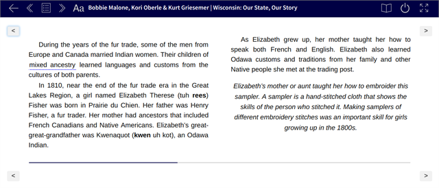
The italicized caption on the right in the screenshot above corresponds to the image of the sampler shown on the next screen (see screenshot below):
Table of Contents
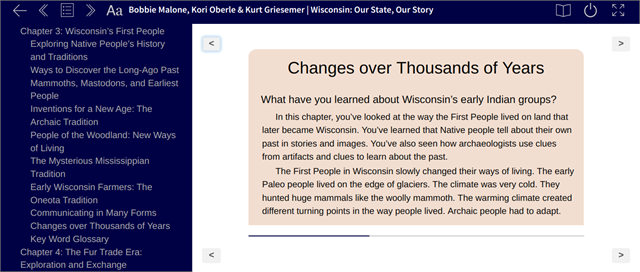
Choosing the bullet-list button in the blue navigation bar will open an interactive table of contents with links that allow students to skip straight to certain chapters and sections. This allows students to easily navigate to specific sections without clicking through multiple screens:
Key word interactivity
Key words are underlined. When students tap or click on the underlined word, they will be taken to a glossary screen. Tapping or clicking on the word in the glossary will return the student to the page where the word first appeared.